
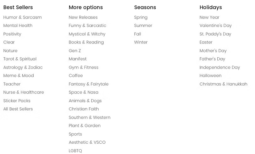
Timeline
April-May 2024 (6 Weeks)
Client
Team Credit
Emily (me)
Alison
Lena
Kefan
Lori
My Role
Product Design
Interaction Design
Design Research
Brand Design
Information Architect
Prototyping
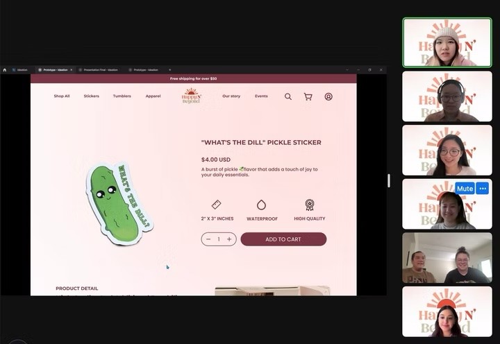
Usability Testing
The Client Challenge
Happy n Beyond, a small Canadian e-commerce company, struggles with an extremely low website conversion rate—99% of visitors exit after the homepage. Despite strong offline sales, this limits online revenue. The goal is to boost online sales and create a website that reflects the brand’s identity.
"Our products are a hit offline, but our website just isn't converting. Most users drop off right after the homepage—there’s definitely room for improvement."

Client H&B Founders
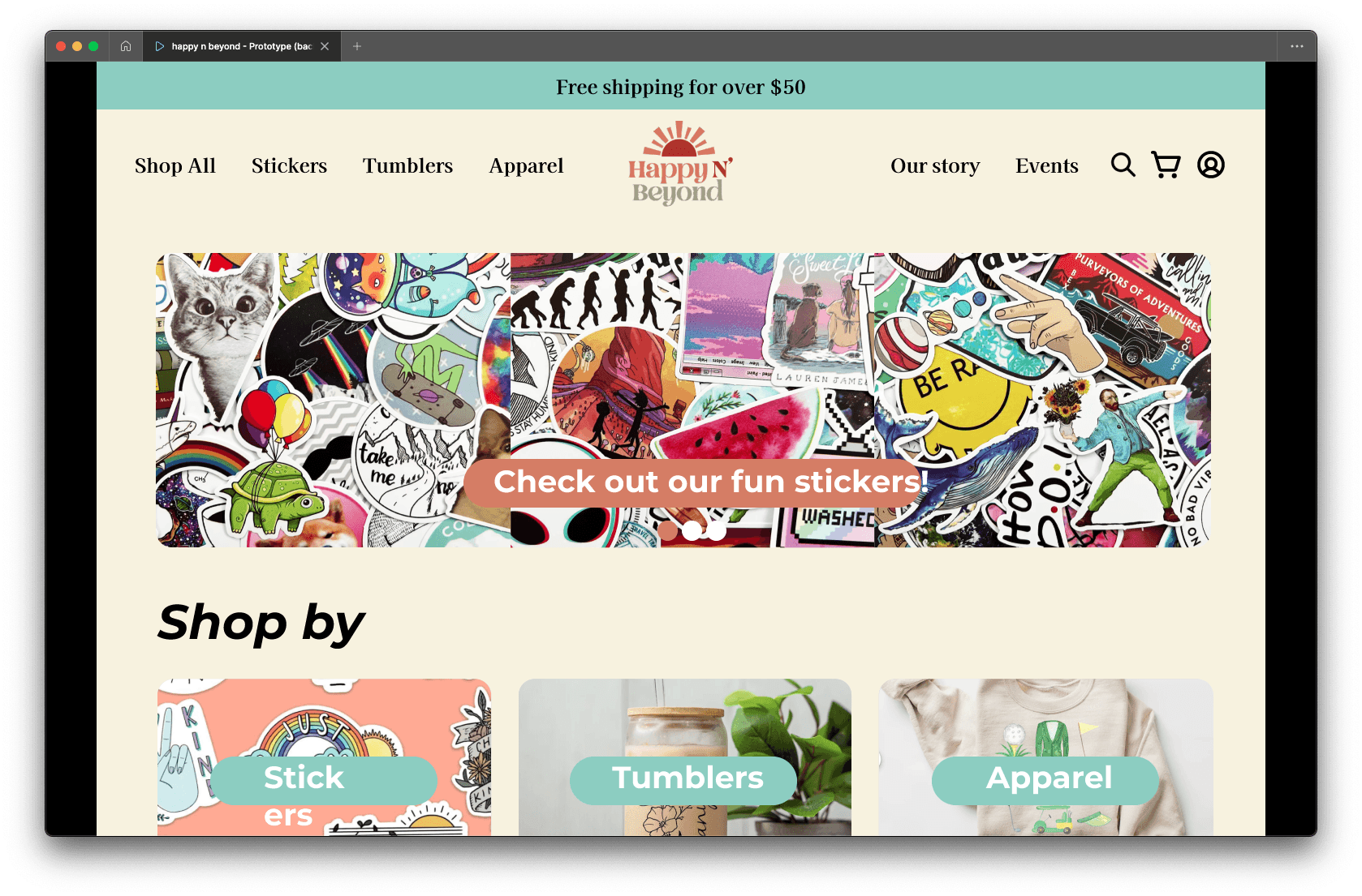
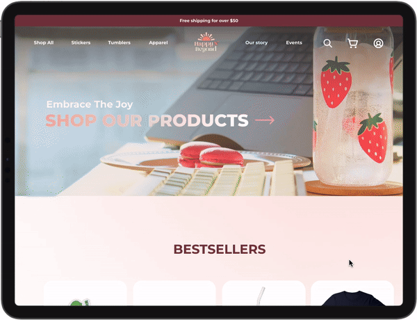
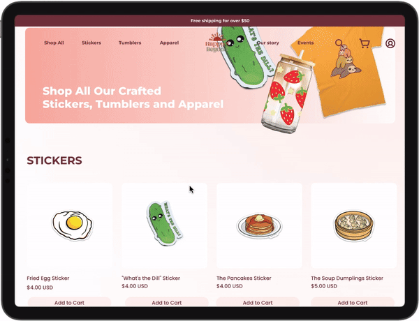
Project Overview
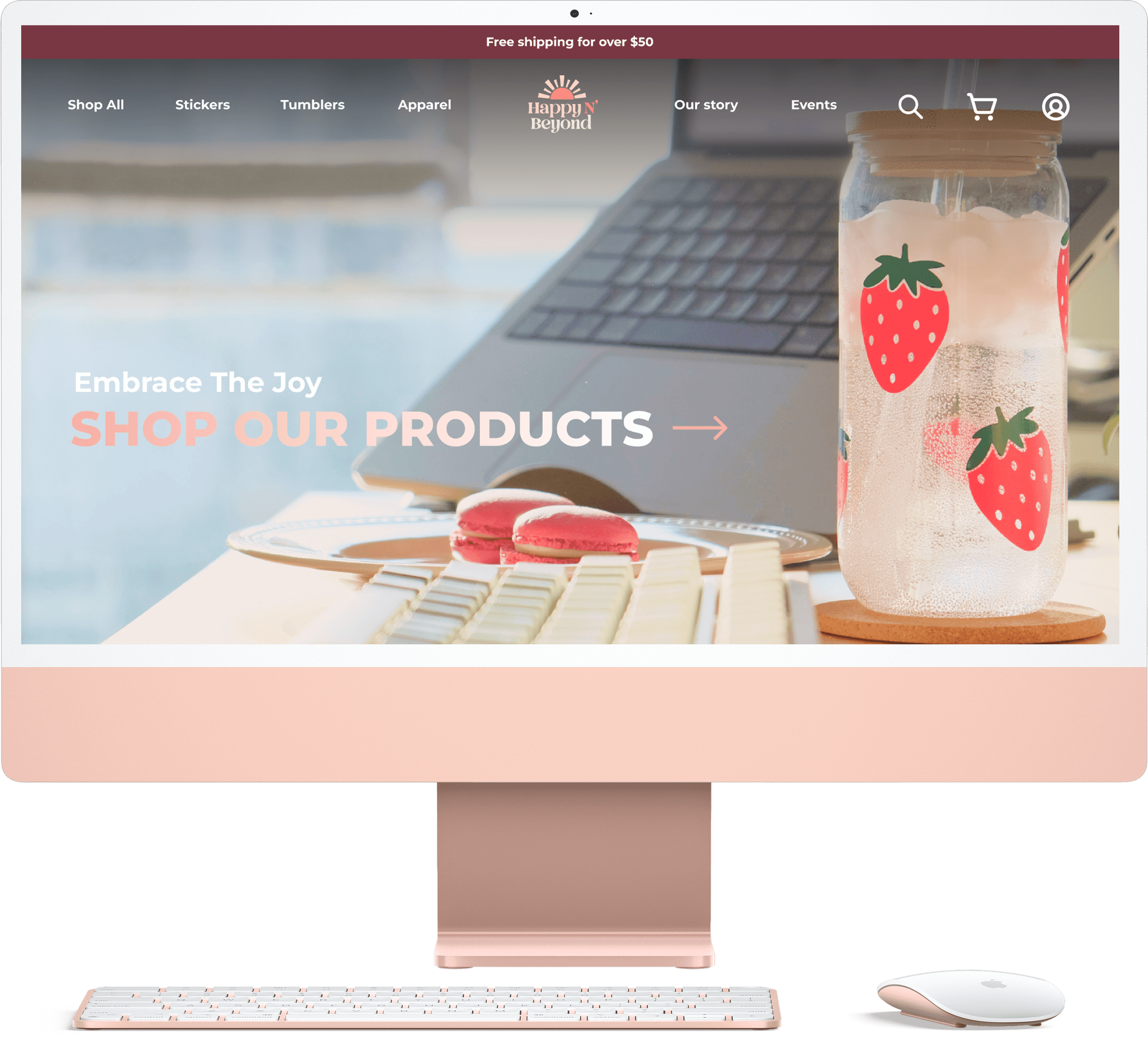
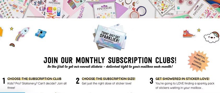
Check out the new Happy N' Beyond site! It’s got an engaging homepage, bold and bright listings, fun brand stories, and all the event details to keep you coming back for more.
Browse HnB's Website
Impact Metrics
People Love E-commerce with Personality.
From user testing, we realized:
✔ Achieved a 90% user satisfaction score for web experience, up from 50%.
✔ Increase average time on site by 50%.
✔ Boosted user satisfaction from 30% to 95%.
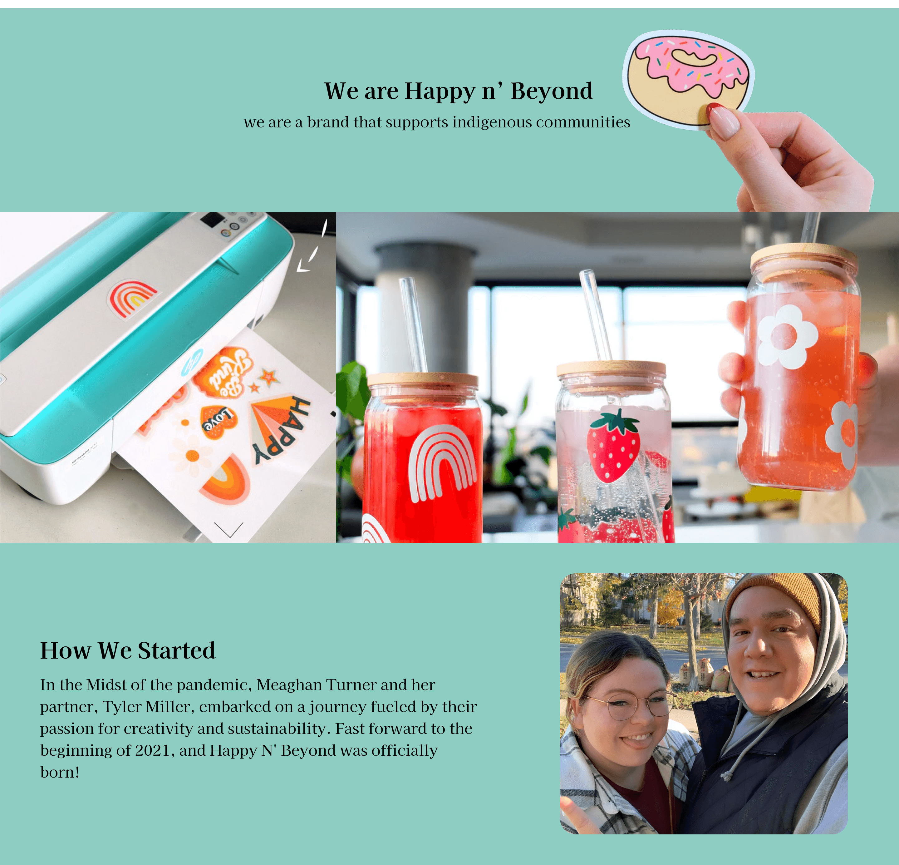
Kickoff
Get to know our Client
Our client initially started their small business on Etsy and local community markets in Canada, however, now they are looking to expand their business and create a well-developed brand site. We worked closely with the brand owner to solve the problem:
How do we improve the UI design and content organization to increase conversion rates?
Challenges
What causes the current low conversion rate?

Plain Layout
There is no featured item promotion, and there is no focus on brand tone, leaving users with no deep impression.

Unattractive Content
All content has no personality, reads without focus, and cannot attract users’ attention

Unclear Branding
This site is not systematically branded. No distinguishing elements compared to other competing sites.
Competitor Analysis
Learn and differentiate our site from other "Sticker sellers"
To stand out from other sticker shops, we studied 14 sticker brands and 12 top-performing e-commerce sites. Our goal? Crack the code on branding and conversions to win over online shoppers who love unique finds.
What we learned?
01 Use of tab buttons for categories and quick search.

Example from: Redbubble
02 Minimalistic and professional visual layout and font choices.
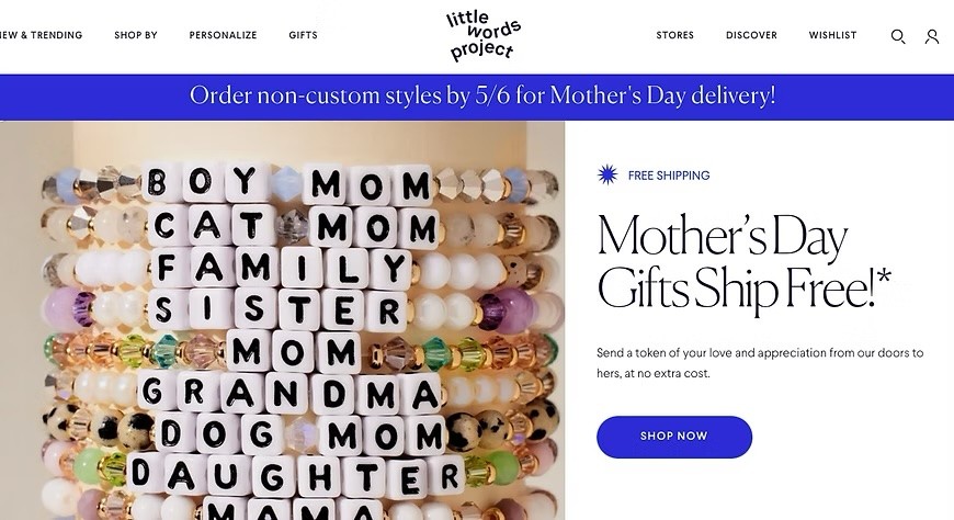
Example from: Littleworldproject
03 A brand story that resonates with and emotionally impacts customers.
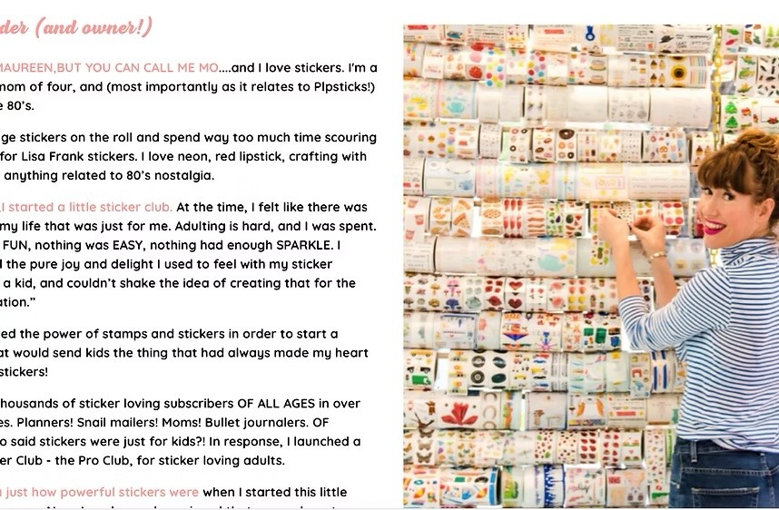
Example from: Popstick
Things to avoid
01 Massive dropdown categories.
Example from: Bigmoods
02 Being too cute and immature.
Example from: Popstick
Learn In Depth
Testing, tweaking, perfecting
We got in touch with a total of 68 potential users and did 30-mins interviews with 15 of them. In the recruiting process, we targeted young females between 18-35, who may buy stickers and tumblers for themselves or their kids in Canada and the US.
3 from Canada, 12 from US
All participants shop online at least once a week.
Participants usually buy stickers for themselves or for friends as gifts.
Use of RITE(Rapid Iterative Testing and Evaluation)
Since our client’s website isn’t fully built yet, we created a prototype for usability testing. Using an iterative design approach, we gather feedback every five user tests and refine the prototype for the next round.
01 The website lacks the brand's own characteristics.
60% of the respondents said that they feel that this website is very much like a startup, and they think the owner is cute and young. This is the impression we don’t want to leave on users.
Initial prototype: Homepage
02 Words matter more than we thought.
In our first prototype, we stuck with the client’s copy and didn’t refine the added text, which led to issues in user testing. Turns out, users do read carefully! If the text isn’t engaging, the site relies solely on product images—losing half its competitive edge.
Initial prototype: Homepage

Initial prototype: Event page
"Before you said the titles are communities in London, Canada, I have no idea what did they mean." - Betty
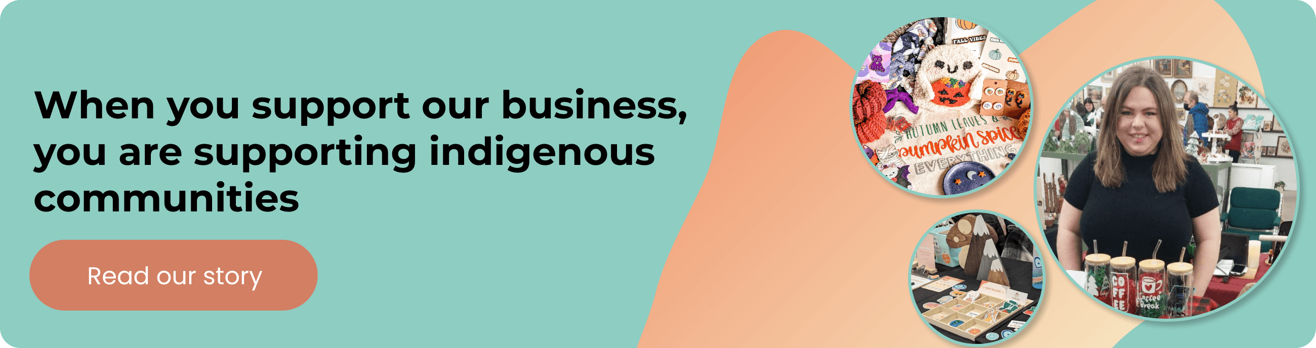
03 Hard to associate indigenous culture with the brand story.
We aimed to highlight the brand’s Indigenous roots and community support, but user testing revealed a disconnect. Participants loved originality and were willing to pay for it, but the brand story felt isolated from the actual products, leaving them confused.
Initial prototype: Our story page
"They left me the impression of embracing the indigenous culture and I would love to support them. However, I'm just confused why their products are so not related to this culture?" - Heidi
Final Prototype
Design decisions towards a raise in user experience and conversion rate.
Test out our prototype
Making the Homepage Hook Visitors

Bringing the Brand to Life
Events: Driving Offline Sales
Users prefer buying low-cost items in person, making community markets a key advantage for our client. To support this, we added a detailed Events page, helping customers easily find and attend local sales—boosting in-person purchases.

Crisp, high-quality product images combined with subtle hover animations keep users engaged and prevent visual fatigue while browsing.
Highlighting Key Features for Better Engagement
When a product stands out with features like being dishwasher-safe, waterproof, or high-quality, we make sure these details are prominently displayed to spark interest.
For deeper insights, features are neatly categorized for clarity and easy browsing.

Reflection
Growing Through Collaboration
Teamwork & Innovation
Working with four designers on a usability project was a rare and enriching experience. More designers meant more creative ideas, but it also required careful decision-making to balance innovation with feasibility. Through back-and-forth discussions, we learned to efficiently evaluate ideas and align them with our client's needs. Over the course of a month, we grew from hesitant decision-makers to confident problem-solvers.
Client Collaboration & Strategy
Designing for a startup client presented unique challenges, as they weren’t always sure what they needed. Beyond usability, we helped them identify key user needs and define a clear marketing direction. This process required deep team discussions, research, and adaptability, but in the end, we successfully carved out a solid path for the project—a rewarding achievement that made all the effort worthwhile.