My Role
Learn our client's needs. Analyze potential competitors. Recruit participants and conduct usability testing—iterative prototypes based on interview feedback.
Team
Product Designer: Emily (Me), Lori, Kefan
Data Analyst: Alison, Lena
Timeline
April-May 2024 (6 Weeks)
Discipline
UXUI Design, User Research, Client Project, E-commerce
Client
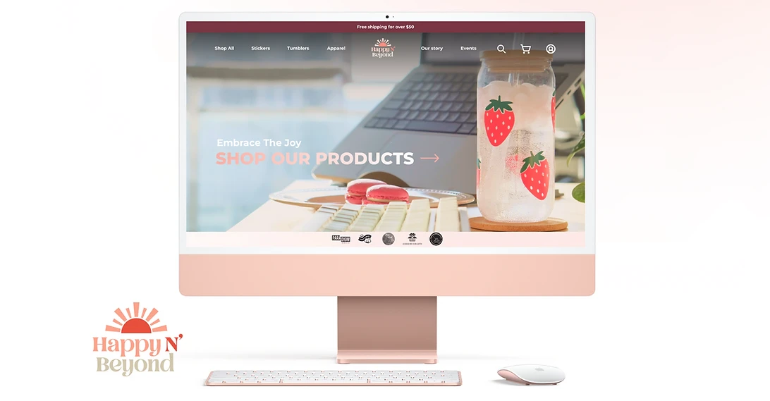
Happy N' Beyond is a small business owned by Canadian women and indigenous people. They sell stickers and tumblers that spread joy.
Case study Overview
As an e-commerce startup, Happy N' Beyond wants to convert more visitors who come to their website into real buyers.
We, 3 user experience designers and 2 data analysts conducted 15 usability tests and thorough analyses with potential users to better position the demand for this website. We utilized rapid iterative design to quickly and accurately improve the content strategy and visual design of the website, to attract customers to make purchases.
Kickoff
Get to know our Client
Our client initially started their small business on Etsy and local community markets in Canada, however, now they are looking to expand their business and create a well-developed brand site. We worked closely with the brand owner to solve the problem:
Challenges
What causes the current low conversion rate?

Plain Layout
There is no featured item promotion, and there is no focus on brand tone, leaving users with no deep impression.

Unattractive Content
All content has no personality, reads without focus, and cannot attract users’ attention.

Unclear Branding
This site is not systematically branded. No distinguishing elements compared to other competing sites.
Competitor Analysis
Learn and differentiate our site from other "Sticker sellers"
To cater to our target audience who love shopping online and buying unique stickers, we conducted research and analyzed 14 sticker brands and 12 e-commerce websites that had a high conversion rate. We aimed to learn how they built up their brands and attracted customers.
Links for more details:
Things to learn
01 Use of tab buttons for categories and quick search.
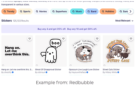
02 Minimalistic and professional visual layout and font choices.
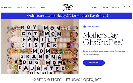
03 A brand story that resonates with and emotionally impacts customers.
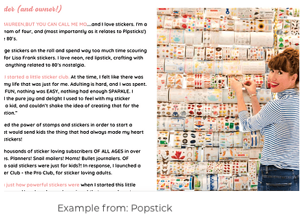
Things to avoid
01 Massive dropdown categories.
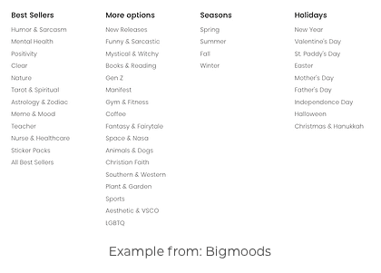
02 Being too cute and immature.

Explore Possibilities
Meet our potential customers
We got in touch with a total of 68 potential users and did 30-mins interviews with 15 of them. In the recruiting process, we targeted young females between 18-35, who may buy stickers and tumblers for themselves or their kids in Canada and the US.
Links for more details:
How did we recruit our interviewees?

Who are our interviewees?

